
What kind of coalition is created in parliaments and how does it change with time? To whom does the independent legislators incline? How does individual state vote in the international organizations like UN or EU? The analysts of KohoVolit.eu answer these questions using a unique visual method.
Different members of one parliament often vote differently. It is not a surprise that legislators from one political party usually vote identically or that parties divide into the government and the opposition. It cannot be, for example, easily found out with whom do independent MPs vote, how parties differ in the rate of identical vote or which parties in the parliament really support minority governments.
Voting of legislators
Luckily, there is a very effective method that can illustratively display the real patterns of voting in the parliament chamber and observe how they changes in time. It is called the multidimensional scaling and it combines the art of statistics and visualization.
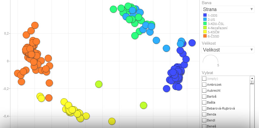
The graph below shows the application of this method for the Chamber of deputies of the Czech parliament from 1998 to 2002. It is an interesting functional term, since the minority government of social democratic ČSSD was formed and it did not have the absolute majority in the lower chamber. It was necessary to find the support for every law so it is interesting to search for the parties that voted identically with ČSSD.
Every point of the graph below represents one MP. The closer two MPs in the graph are, the more often they vote identically. If two MPs voted exactly the same in each case, they would be located on the same spot.
![]() Graph showing the outcome of the multidimensional scaling of voting in the Chamber of deputies of the Czech parliament from 1998 to 2002. The animation can be launched by clicking on the button with triangle (“play”) in the lower left part of the graph. The visualization was created with the package NOMINATE for programming language R and Google Drive tool. Author: Kamil Gregor, KohoVolit.eu.
Graph showing the outcome of the multidimensional scaling of voting in the Chamber of deputies of the Czech parliament from 1998 to 2002. The animation can be launched by clicking on the button with triangle (“play”) in the lower left part of the graph. The visualization was created with the package NOMINATE for programming language R and Google Drive tool. Author: Kamil Gregor, KohoVolit.eu.
Political parties in the graph create clusters, which corresponds with the reality, that MPs of one party vote identically. The closer two clusters of MPs are, the more often MPs of these two parties voted identically.
The vertical axis of the graph (dimension X) separates ČSSD and communist KSČM (on the left) from the liberal-conservative party ODS, Christian democrats KDU-ČSL and the liberal party US-DEU (on the right). This division reflects the voting, when ČSSD and KSČM voted identically against the three other parties.
The horizontal axis of the graph (dimension Y) symbolizes a rather lesser separation of ČSSD, KDU-ČSL and US-DEU (on the top) from ODS and KSČM (on the bottom). This division reflects the voting, when ČSSD, KDU-ČSL and US-DEU voted identically against ODS and KSČM. The minority government of ČSSD in parliament was in reality supported mainly by KSČM because its MPs are located the closest to MPs of ČSSD.
Multidimensional scaling helps to answer the question of how the independent MPs vote. In some parliaments, there is a huge amount of them and sometimes, even the governmental majority depends on them. This was the case, for example, of the Chamber of deputies of the Czech parliament in the functional term 2010-2013. In this situation, it is very important to observe, how the independent MPs connect with others and how their loyalty develops in time.
The graph below shows the outcome of multidimensional scaling in this term. Independent MPs are displayed in red. It is obvious that their number has increased in time. Many of them have changed their loyalty to the government or opposition and therefore have moved in the graph.
![]() Graph showing the outcome of multidimensional scaling of voting in the Chamber of deputies of the Czech parliament in the part of the functional term of 2010-2013. The animation can be launched by clicking on the button with triangle (“play”) in the lower left part of the graph. The visualization was created with the package NOMINATE for programming language R and Google Drive tool. Author: Kamil Gregor, KohoVolit.eu.
Graph showing the outcome of multidimensional scaling of voting in the Chamber of deputies of the Czech parliament in the part of the functional term of 2010-2013. The animation can be launched by clicking on the button with triangle (“play”) in the lower left part of the graph. The visualization was created with the package NOMINATE for programming language R and Google Drive tool. Author: Kamil Gregor, KohoVolit.eu.
Generally, we can identify three types of independent MPs. The first left their political party but they still voted identically with it so they do not move much in the graph. The case of such MP is Jiří Paroubek. The second type of independent MPs are those, who after leaving their party join the other political side (basically from the government to the opposition or the other way round). These include for example Stanislav Huml, who left the governmental party VV and joined the opposition party ČSSD.
The last type includes MPs who repeatedly “turncoat” between government and opposition. For example Josef Dobeš or Jaroslav Škárka left parliamentary clubs of the governmental parties and started voting with the opposition. In the graph, this is presented by the movement from right to left. However, they changed their vote in the end of the functional term and started to support their governmental colleagues once again. Therefore, they moved to the right again in the graph.
During the functional term of 2010-2012 one entire political party has noticeably changed its voting. It was the case of the populist party VV, which was originally a member of the governmental coalition so that its members voted identically as their governmental colleagues. After abandoning the government, they started to vote as the other opposition MPs, which resulted in their movement from the right part of the graph to the left.
Each parliament is very different in its voting patterns. Let’s compare for example the outcome of the multidimensional scaling for the National council, the unicameral parliament of Slovakia in 2010-2012 and the People’s Chamber, the lower house of the Federal assembly of the former Czechoslovakian state in 1990-1992.
At first sight, we can see that the MPs in the National council form two very close clusters that does not change in time much. That means that Slovakian MPs were very disciplined, because in most cases, they voted identically as their partisan colleagues. The division into two clusters reflects the division into the government (on the right) and opposition (on the left).
The voting in the People’s Chamber seems obviously absolutely different. Primarily at the beginning of the monitored term, we cannot see any clusters because all MPs voted independently from their partisan colleagues to a certain extent. Only in the course of the term, they slowly begin to “condense” to a rather closed clusters. It means that with time, they started to vote identically more.
![]()
Graph showing the outcome of the multidimensional scaling of voting in the Slovakian National council in the functional term of 2010-2012. The animation can be launched by clicking on the button with triangle (“play”) in the lower left part of the graph. You can choose and observe an individual MP in the menu in the lower right side of the graph. The visualization was created with the package NOMINATE for programming language R and Google Drive tool. Author: Kamil Gregor, KohoVolit.eu.
![]() Graph showing the outcome of the multidimensional scaling of voting in the People’s Chamber, the lower house of the Federal assembly of Czechoslovakia in the functional term of 1990-1992. The animation can be launched by clicking on the button with triangle (“play”) in the lower left part of the graph. You can choose and observe an individual MP in the menu in the lower right side of the graph. The visualization was created with the package NOMINATE for programming language R and Google Drive tool. Author: Kamil Gregor, KohoVolit.eu.
Graph showing the outcome of the multidimensional scaling of voting in the People’s Chamber, the lower house of the Federal assembly of Czechoslovakia in the functional term of 1990-1992. The animation can be launched by clicking on the button with triangle (“play”) in the lower left part of the graph. You can choose and observe an individual MP in the menu in the lower right side of the graph. The visualization was created with the package NOMINATE for programming language R and Google Drive tool. Author: Kamil Gregor, KohoVolit.eu.
Voting of representatives
In the same manner we can visualize the voting in any representative body, including national parliaments but also regional and municipal councils or supranational elected bodies such as the European parliament.
For example, the graph below shows the outcome of an analysis of voting in the local government of municipality Plasa, which has about 2600 inhabitants and is located in the western part of the Czech Republic. This local government has only 15 members. Due to the fact that the results of every voting are recorded by names of every representative, we can conduct the analysis.
![]()
Graph showing the outcome of multidimensional scaling of voting in the local government of the municipality Plasa in the functional term of 2006-2010. The animation can be launched by clicking on the button with triangle (“play”) in the lower left part of the graph. You can choose and observe an individual representative in the menu in the lower right side of the graph. The visualization was created with the package NOMINATE for programming language R and Google Drive tool. Author: Kamil Gregor, KohoVolit.eu.
Voting of states in the General Assembly of UN
Even other institutions, where voting occurs, such as the European council, bank councils of national banks or senates of the constitutional courts, can become subjects of analyses.
Let’s demonstrate the opportunities of this method on the example of the General Assembly of UN. It is a global “parliament”, whose members are not only individuals but also member states. Since 1946, it has held more than 5000 votes about basically every crucial event of world history. Vote of every state has the same value regardless of it’s wealth or size.
Graph below shows the outcome of multidimensional scaling of all these votes. States are coloured according to their allegiance to political blocs. This classification is constant, so for example Hungary is labeled as a state of the eastern bloc even after 1990. To secure clarity, political allegiance is presented on the map of current states below.
![]() Graph showing the outcome of multidimensional scaling of voting in the General Assembly of UN from 1946 to 2012. The animation can be launched by clicking on the button with triangle (“play”) in the lower left part of the graph. You can choose and observe each member state in the menu in the lower right side of the graph. The visualization was created with the package NOMINATE for programming language R and Google Drive tool. Author: Kamil Gregor, KohoVolit.eu.
Graph showing the outcome of multidimensional scaling of voting in the General Assembly of UN from 1946 to 2012. The animation can be launched by clicking on the button with triangle (“play”) in the lower left part of the graph. You can choose and observe each member state in the menu in the lower right side of the graph. The visualization was created with the package NOMINATE for programming language R and Google Drive tool. Author: Kamil Gregor, KohoVolit.eu.
![]()
Map showing the allegiance of current states to political blocs used in the graph of multidimensional scaling of voting in the General Assembly of UN. The map was created with Google Drive tool. Author: Kamil Gregor, KohoVolit.eu.
Each state is represented in the graphs above by an identically large point, which expresses the reality that all states have one vote in the General Assembly. Due to this, it is hard to distinguish for example USA from other small states at first sight. That is why you can find a graph below, where the size of state corresponds with the number of its inhabitants in particular years. Data about population was taken from the website Gapminder.
![]()
Graph showing the outcome of multidimensional scaling of voting in the General Assembly of UN from 1946 to 2012. The animation can be launched by clicking on the button with triangle (“play”) in the lower left part of the graph. You can choose and observe each member state in the menu in the lower right side of the graph. The visualization was created with the package NOMINATE for programming language R and Google Drive tool. Author: Kamil Gregor, KohoVolit.eu.
Some states in the graph form obvious clusters. That reflects the fact that these states often voted in the General Assembly identically. Until the 90’s, we can observe three main clusters – cluster of the Warsaw pact countries (orange), cluster of the NATO member states (dark blue) and a large cluster of other states (light blue, yellow and green).

Graph showing the outcome of multidimensional scaling of voting in the General Assembly of UN in 1973. The visualization was created with the package NOMINATE for programming language R and Google Drive tool. Author: Kamil Gregor, KohoVolit.eu.
It is interesting that the other states voted almost always identically as the western superpowers in the cold war era, except two clearly divided terms – the first half of the 70’s and the second half of the 80’s. The division East – West stopped existing after the fall of the Iron curtain and was replaced by the division into “global North” (in the right part of the graph) and “global South” (in the left part of the graph), which is represented by countries like Iran or Syria. This division is currently predominant.

Graph showing the outcome of multidimensional scaling of voting in the General Assembly of UN in 2007. The visualization was created with the package NOMINATE for programming language R and Google Drive tool. Author: Kamil Gregor, KohoVolit.eu.
In the graph we can definitely observe that some states have radically changed their voting in the General Assembly as a result of certain political events. For example, Yugoslavia left the cluster of communist countries after the dispute with the Soviet Union in 1948.

Graph showing the outcome of multidimensional scaling of voting in the General Assembly of UN from 1947 to 1953. The visualization was created with the package NOMINATE for programming language R and Google Drive tool. Author: Kamil Gregor, KohoVolit.eu.
On the contrary, Cuba moved in the opposite direction after Castro’s revolution in 1959.

Graph showing the outcome of multidimensional scaling of voting in the General Assembly of UN from 1956 to 1963. The visualization was created with the package NOMINATE for programming language R and Google Drive tool. Author: Kamil Gregor, KohoVolit.eu.
Albania is the exception to this rule, since it went through three important political milestones in the second part of the 20th century- the soviet-albanian dispute in 1955, sino-albanian dispute in 1972 and the fall of the communist system in 1991 and 1992. However, the first two events had no impact on the voting of this country in the General Assembly.
A number of former communist countries radically changed their voting after the dissolution of USSR and the fall of the Iron curtain. Czechoslovakia can be an example, as after 1989, it moved to the countries of the Western bloc, until it was replaced by the Czech republic in 1993.

Graph showing the outcome of multidimensional scaling of voting in the General Assembly of UN from 1987 to 1990. The visualization was created with the package NOMINATE for programming language R and Google Drive tool. Author: Kamil Gregor, KohoVolit.eu.
Voting of states in the European council
Another example of a voting analysis in other institutions than in parliaments, is an analysis of voting in the European Council, the main body of the European Union, where the prime ministers and heads of member states hold meetings. Since January until the end of November 2013, there was approximately 70 voting sessions. If we apply multidimensional scaling of the results, we can clearly see that most countries vote almost identically, which implies the fact that most votes are to some extent agreed on in advance, so the voting is just formal. The exception is the Great Britain, which votes against the majority much more often than the other states do.
![]()
Graph showing the outcome of multidimensional scaling of voting in the European Council since January until November 2013. The visualization was created with the package NOMINATE for programming language R and Google Drive tool. Author: Kamil Gregor, KohoVolit.eu.
The size of bubbles, standing for the states, can be changed in order to comply with the number of votes that the member states of European Union are endowed with:
![]()
Graph showing the outcome of multidimensional scaling of voting in the European Council from January to November 2013. The visualization was created with the package NOMINATE for programming language R and Google Drive tool. Author: Kamil Gregor, KohoVolit.eu.
Decision making of constitutional judges
Another kind of a collective body, whose voting can be analysed is the senate of supreme courts. Even here, the individual members decide in the form of voting or by releasing their opponent’s references. Analysis is interpreted similarly as in the case of legislators or states: the closer two judges are located, the more they decide identically.
![]()
Graph showing the outcome of multidimensional scaling of the decision making of judges of the Constituional court of the Czech Republic. The visualization was created with Google Drive tool. Author: Kamil Gregor, KohoVolit.eu.
About multidimensional scaling
And how is such “map of voting” created? You surely know the table of distances from road atlas, which clearly shows the mutual distance of two towns. This table is formed on the basis of measuring real location of towns in a map of a state.
Imagine finding such table showing the distances of towns for a state that you have never seen on a map. Would you be able to reconstruct what the state looks like? Yes, with certain accuracy. You would have to find such mutual position of towns in a map in order to preserve the distances of each pair of towns. And this can be done by mathematical algorithm.
When creating a “map of voting”, the procedure is the same. We start with a table, which shows the “distance” of states. In this case, it is not the distance in kilometeres, but the frequency of identical voting, which is expressed for example by the correlative coefficient. Then all that is needed is to find such combination of mutual distance of all countries, where their distance corresponds with the frequency of identical voting.
It is obvious that the axes X and Y do not have any factual meaning in the “map of voting”, similarly, as the manner in which we measure the geographical latitude and longitude does not influence the real distance of two countries on Earth. If we expressed the location differently, the world itself would not change. Points in the graph of voting can be turned around the outset arbitrarily without any information loss.
In case you want to know more about the visualization of multidimensional scaling of voting or you wish to create similar visualization, do not hesitate to contact us.
Further reading
Related analyses
Jak zákonodárci předkládají návrhy zákonů (analýza sítí)
Jak návrhy zákonů prochází legislativním procesem (Sankeyho diagram)
Nástroje watchdogu aktivity zákonodárců
Related media entries
Related blog arctiles
Kamil Gregor: Unikátní animace 67 let světové historie (18.11.2013)
Kamil Gregor: 67 years of animated history with open voting data (14.09.2013)
KohoVolit.eu: Naše volební vizualizace slaví úspěch v zahraničí (22.04.2013)
Kamil Gregor: Dobeš aneb cesta tam a zase zpátky (26.02.2013)
KohoVolit.eu: Data: V Ostravě zvolili pravičáka, Okamura hlasuje jako Michálek (19.02.2013)
Michal Škop: 101. poslanec dnes – kolik hlasů má vláda? (12.05.2012)
Michal Škop: Kdo s kým ve Sněmovně (26.04.2012)
KohoVolit.eu: Analýza hlasování v Národní radě SR v letech 2010-2012 (29.02.2012)
Related audio and video recordings
Kamil Gregor, Michal Škop: KohoVolit.eu – eDemocracy Day 2013 v Bratislavě, část 1. (27.11.2013)
Kamil Gregor, Michal Škop: KohoVolit.eu – eDemocracy Day 2013 v Bratislavě, část 2. (27.11.2013)
Michal Škop: Univerzita Karlova v Praze – Jak vizualizovat politiku? (06.03.2012)